Design isn’t just about making things look good—it’s about communication, clarity, and creating meaningful experiences. Whether you’re designing a website, logo, poster, or social media graphic, understanding core design principles is essential. These fundamentals help transform ordinary visuals into powerful, effective designs.
Here are the top 10 basic principles every designer should know:
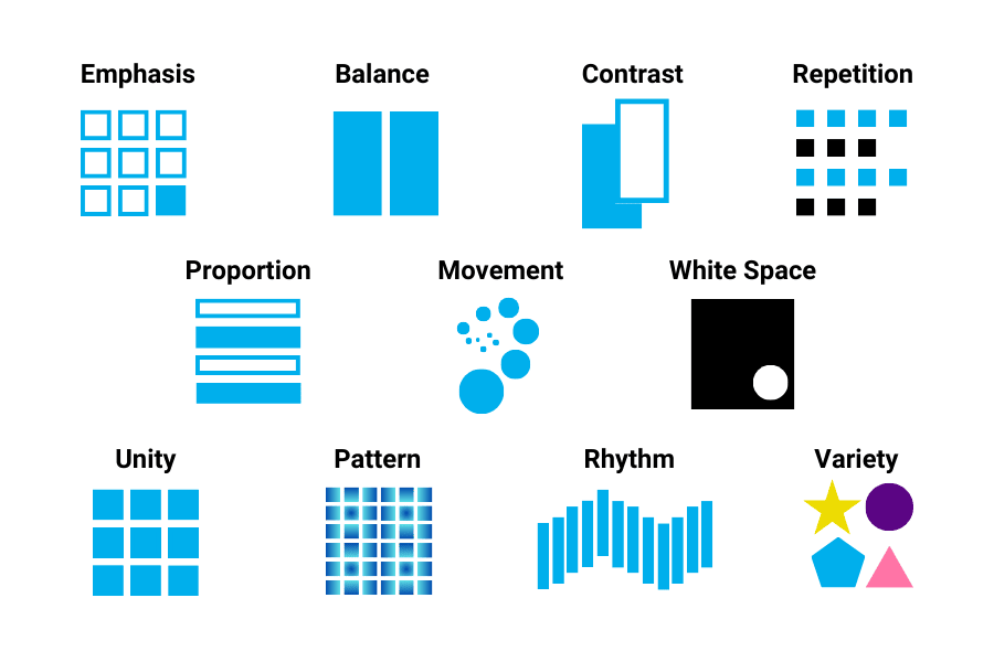
1. Balance
Balance refers to the distribution of visual weight in a design. It creates stability and structure.
- Symmetrical balance: Equal weight on both sides (formal and clean)
- Asymmetrical balance: Different elements balanced by contrast (dynamic and modern)
- Radial balance: Elements arranged around a central point
A well-balanced design feels comfortable and visually pleasing.
2. Contrast
- Light vs dark
- Big vs small
- Bold vs thin
3. Hierarchy
Visual hierarchy guides the viewer’s eye to what matters most.
- Use size, color, and placement to prioritize elements
- Headlines should stand out more than body text
- Important elements should be noticed first
Good hierarchy ensures your message is clear and easy to follow.
4. Alignment
Alignment creates order and organization in a design.
- Left, right, center, or justified alignment
- Keeps elements visually connected
- Avoid random placement
Proper alignment makes designs look clean and professional.
5. Repetition
Repetition strengthens a design by creating consistency.
- Repeat colors, fonts, shapes, or styles
- Helps build brand identity
- Creates unity across different pages or elements
Consistency makes your design recognizable and cohesive.
6. Proximity
Proximity groups related elements together.
- Items placed close together are perceived as related
- Helps reduce clutter
- Improves readability and organization
This principle helps users quickly understand relationships between elements.
7. White Space (Negative Space)
White space is the empty space around elements.
- Prevents overcrowding
- Improves focus and readability
- Gives a clean, modern look
More space doesn’t mean less design—it often means better design.
8. Emphasis
Emphasis is about creating a focal point.
- Highlight the most important element
- Use color, size, or placement to draw attention
- Avoid competing focal points
A strong focal point ensures your audience knows where to look first.
9. Movement
Movement guides the viewer’s eye through a design.
- Use lines, shapes, and layout flow
- Create a visual path
- Direct attention from one element to another
Good movement makes designs feel interactive and engaging.
10. Unity (Harmony)
Unity ensures all elements work together as a whole.
- Consistent style, color, and typography
- Elements should feel connected
- Avoid mixing too many styles
A unified design feels complete and professional.
Final Thoughts
Mastering these basic design principles is the foundation of great design. They are not strict rules but guidelines that help you create visually appealing and effective work. As you gain experience, you’ll learn when to follow them—and when to break them creatively.
Whether you’re a beginner or an experienced designer, revisiting these principles will always strengthen your skills and improve your designs.